
What we did
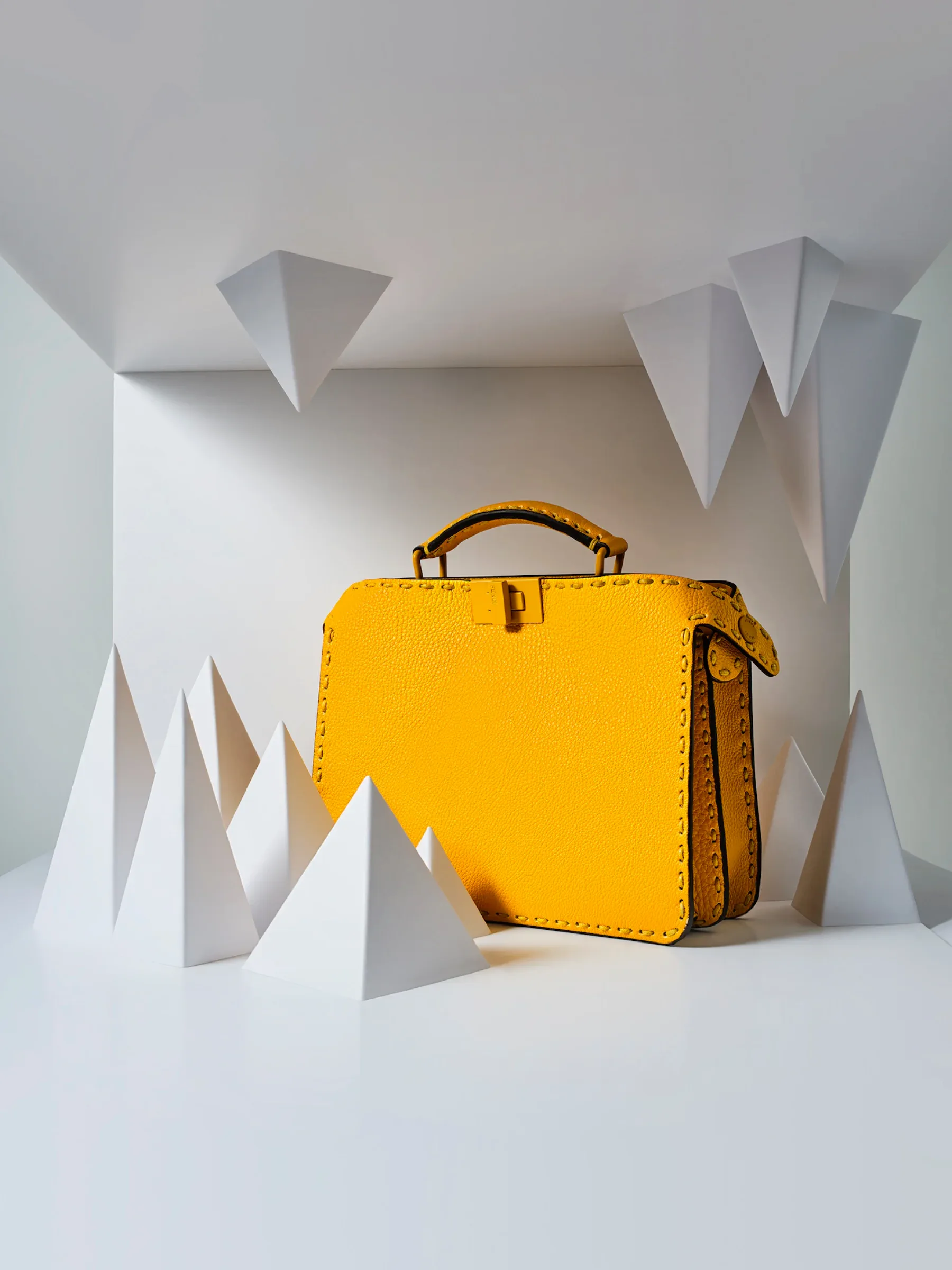
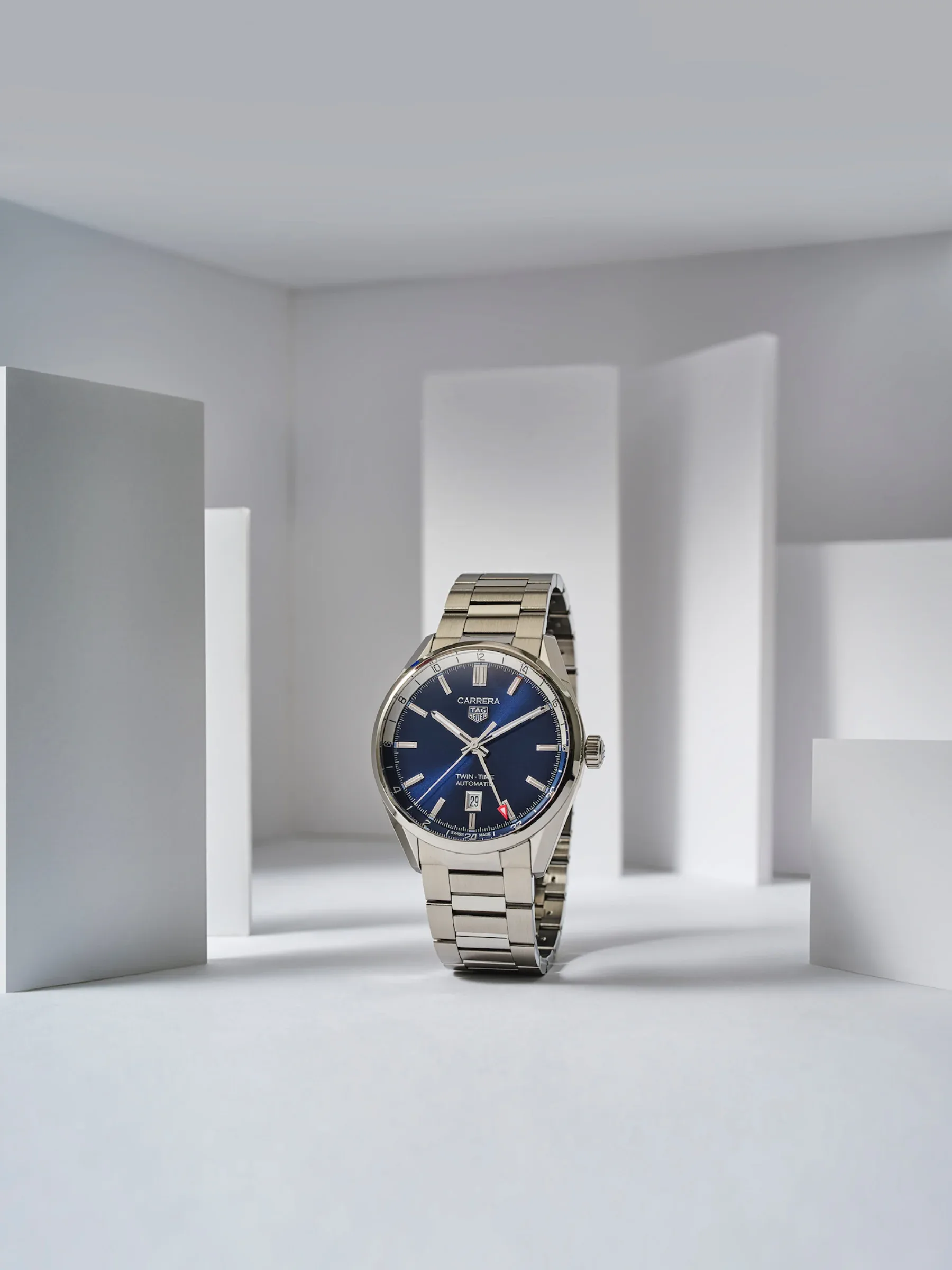
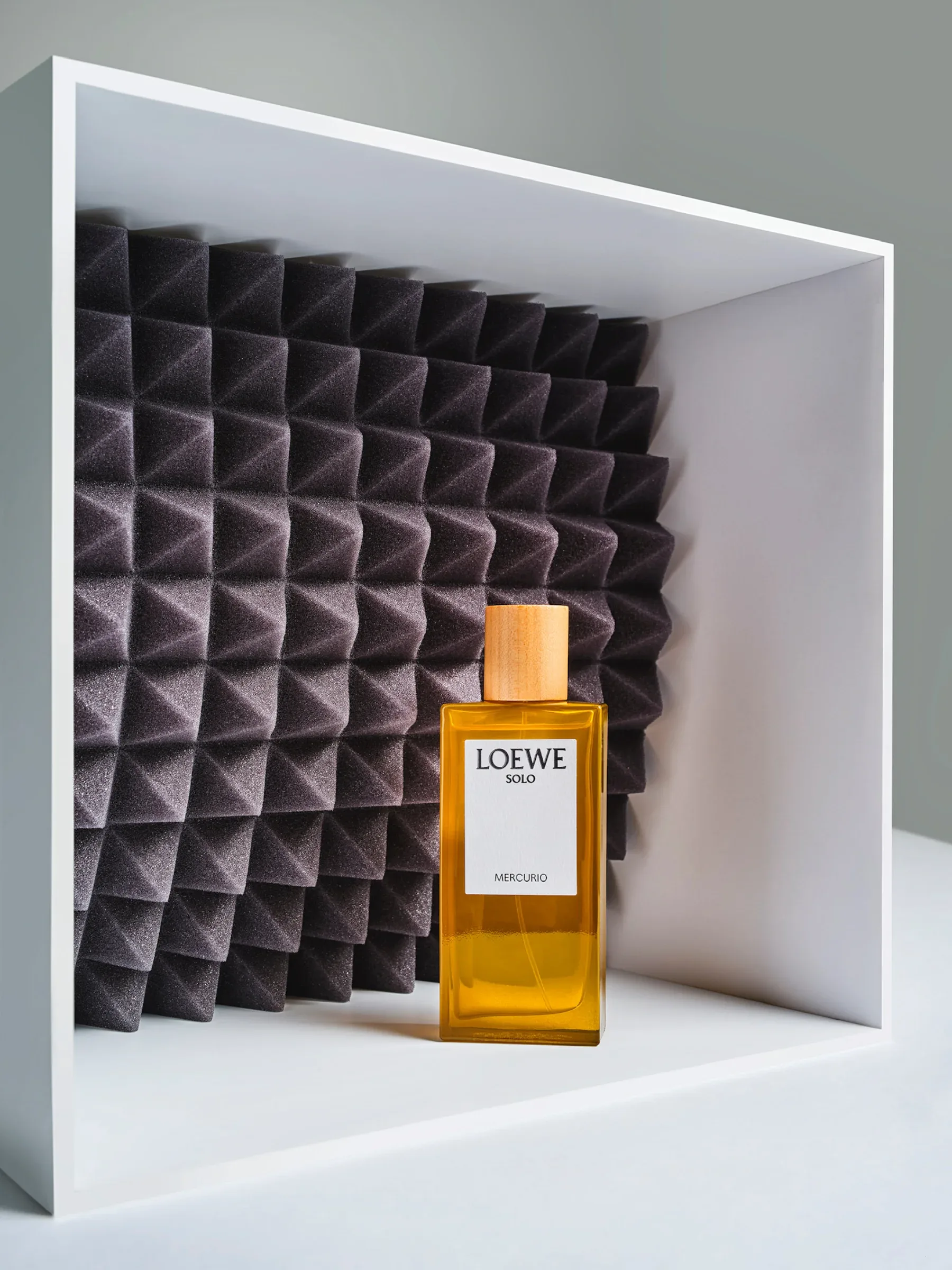
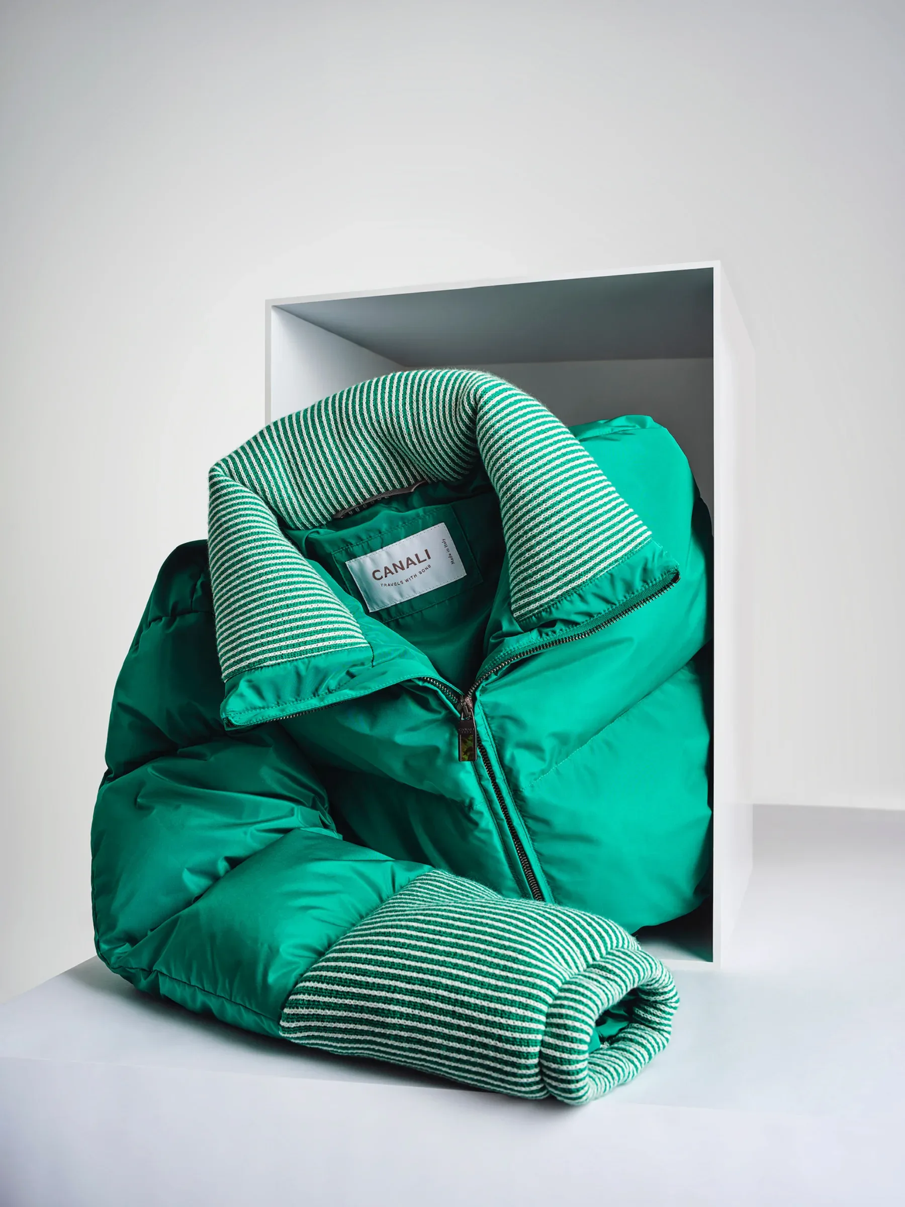
We developed a series of white boxes and backgrounds. Products sat inside the boxes, balanced on their edges or extended beyond them. Changing the arrangement and shadows gave each object its own composition within the series.

The brief
Esquire Russia’s monthly Editor’s Picks featured ten products, one per page. Different brands, sizes, colours and shapes needed a consistent treatment that could adapt to a new selection each month.
We developed a series of white boxes and backgrounds. Products sat inside the boxes, balanced on their edges or extended beyond them. Changing the arrangement and shadows gave each object its own composition within the series.
The partnership ran for three years: 36 monthly editions and 360 product pages photographed in Moscow.
Contact the studio
Send us your product, references, dates and location. We’ll discuss what you need and prepare a quote.
Request a quote Prefer email? Send us your brief.
